Comparison of different pieces
Andy Warhol is a well know figure in the 20th century, he has been an influential person especially within the pop art. He has had a lifetime where he has produced art works and I will here take a closer look at some of his screening pieces. This is due to the enormous amount of works he created during his lifetime, and this article will just talk about his general technique and how it has changed.
His technique within the screen-printing was used and reproduced over and over again. The only things that changed were the different motives. There is also a distinct difference if you compare his older with his latest screen-printings. This difference is due to the development of the quality in the field of the photography, and with the development of the cameras. Further you have the development in the colour aspect, where the colours get stronger and clearer.
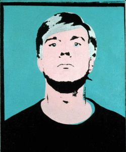

There is a very clear strong difference when you compare these two pieces, the one to the left is a self-portrait of Andy Warhol and it was created in 1964. While the piece to the right is a portrait of Michael Jackson and it was made in 1984. The most prominent difference is the colours, and then there is the quality of the photography, which was used as a ground base in most of his works. Further there is another extinct difference that I only started to use in the later works he produced and that is his own personal lines within the screening.
The development of when he first started with this is still a little unclear, but the transition is there and it elevated his later works to a new level. They are more sophisticated and the quality of each piece is much higher. There is easy to see how he as refined his technique through out his career.
Now if we take a look at some of his earlier works we will see that his style and lines are not as refined and clean as in his later works (the M.J. piece).
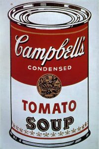
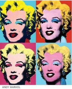
In this section we have on the left Warhol’s famous Campbell’s canned soups and his many Marlin’s. As you can see the canned soup is made in a different style, it is an illustration and not photography. Further the colours are clearer then in the Merlin piece. This is due to the quality of the photography itself, but then again this has become one of his most known features in screen-printing.
Screen-printing is only one of the many fields and genera that Andy Warhol created art in, within the screening it came to a point where the quality or the motives on the art works themselves, were less important then the fact that it was made by Andy Warhol. Even misprints were highly sought after, not because of the artwork itself, but because it was a Warhol, due to the quality these were cheaper to obtain then the more, well made ones. Such as this one:
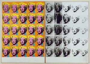
The interesting part when it comes to his works is that the date, the purpose they were made for, had significant or little value at all. The value came because it was made or touched by him. Warhol became famous in his lifetime, he was already before he became known in the higher circles a very sought after artist. He was highly recommended and awarded for his works from a very early stage. This grew along with his carrier and as his directions in art shifted though out is life. He always kept making his screen-printings. He refined the techniques and the quality of the works, but even after the time he had refined his techniques he still kept making the other and previous variations.
Due to this it can be very hard to define when the first production of this variation was made. In many cases there are no date connected to the print itself and it falls under the category as the Merlyn’s, Elvis’s or the Campbell’s. Therefore the date of when it was made is not important, the important aspect is that it is an Andy Warhol.
One comparison we can do to see how he overlapped his old screening technique with his new ones is to compare two pieces that are made not so far from each other. And these are his $ and his Michael Jackson.
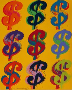

Here you can see the difference of two styles he kept creating over and over again, the one to the left is where he illustrates rather then using photos, but if you take a closer look you can still see that he uses the line works as he does in the piece to the right. Further he tries in the piece to the left to create an older variation that is closer to his earlier years compared to his newer works.
So now let us compare three pieces that share the same similarities or method but are created at different times.
Here there are 3 different pieces, the bottom piece is the olde ones. These ones is from the periode when he first started to create the screening objects. They are more simple, has a bigger focus on different colours to see how they work together and how you can blend and mix different medias. This one is a photo which he screen printed in a variety of different colour combinations, and because he kept his negatives he could reproduce these works over and over again.
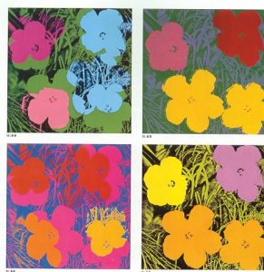

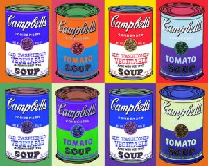
The first ones to the left had the middle age of these 3 pieces, you can still see his hand mate illustrated works and lines, where he has created different soup cans, and here he has experimented with different colours. If you see all of these together you can see that they have the same simple forms with a stronger focus on the the colour combinations. Here you can also see that there is difficult to see what time they are from and the lines blur together. The focus of when, why and how questions surrounding art works in general does not apply to Andy Warhol. It is simply a Andy Warhol, at the peek of his career everyone wanted to have a Warhol. After Warhole’s death his pieces became even more valuable and later the screen print of Michale Jacson that is shown in this article was sold for an astonishing $1 million shortly after his death.
Warhol has been a major part of the development of the screen-printing and the further development of the screening as an art form and not only for advertising purpose. In the 20th century Warhol is one that is referenced to in every aspect with the connection to the genera of pop. The screening has not got the distinct focus and appreciation as it should for his collected works within the genera. Everything has melted together in a big pot and became its own term of a Warhol or/in combination with pop.
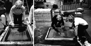
This is some photos of Andy Warhol in process of making his stencil for a Campbell’s canned soup. After the stencils are done he could reproduce the same motive over and over again, he could create a numerous variation of the same piece. This gave him a big advantage to create high numbers of the same art works. This is also one of the reasons why it is so hard to know when certain pieces are made. This is due to the high number as well as the opportunity to create them at any point. This means older or newer stencils could reproduce new artworks and publish them at the same time. This has also strengthened the fact that the important aspect is not when it is made or why. It is an Andy Warhol and that in itself, was more then enough.
